
There’s been a lot of discourse recently around seasonal colour analysis aka the best colours for you. Confidence in what we’re wearing comes from a few sources; it can be in part attributed to beauty components, like how we’ve styled our hair, or how our makeup turned out. Or, a result of discovering your perfect pairing of items in your closet to emphasise your best features. And it can be driven by wearing colours that make our complexion look bright and our eyes shine. But there’s also a difference between the colours that were made for you, and the colours you feel best in. So instead of focusing on best colours, today we’re going to talk through one very simple way to add colour to your wardrobe.
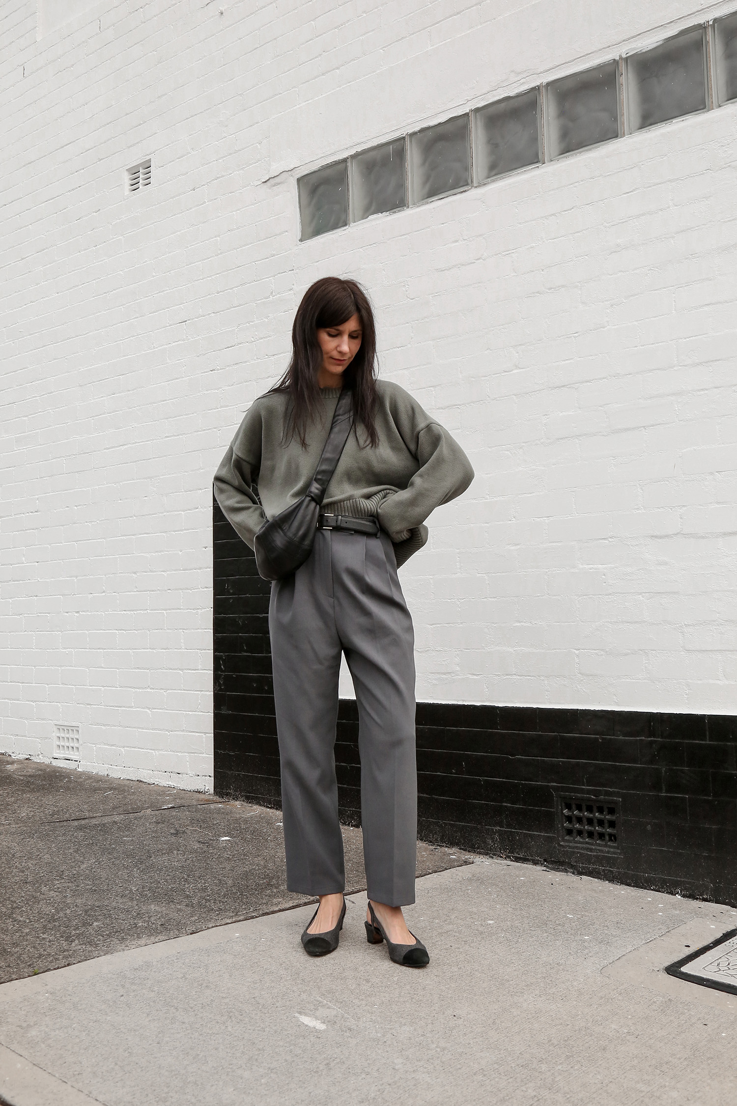
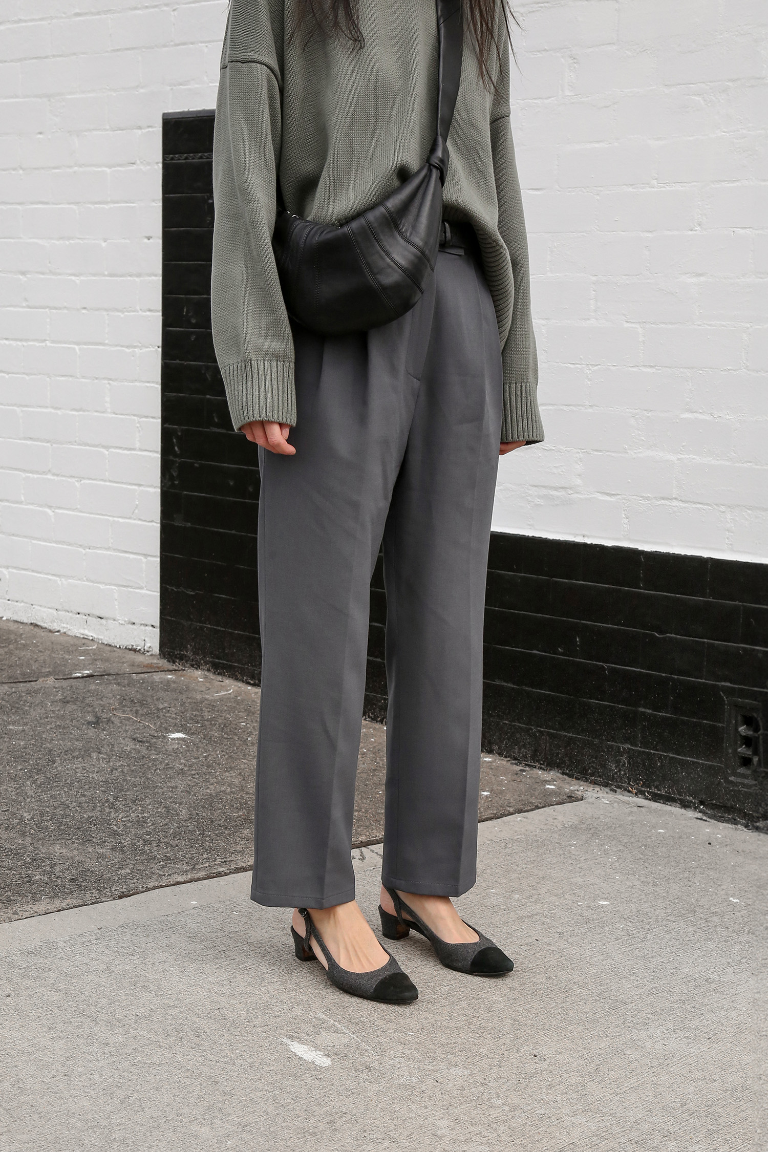
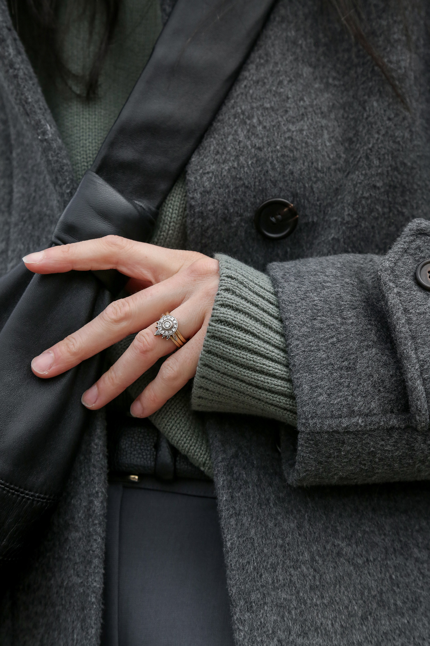
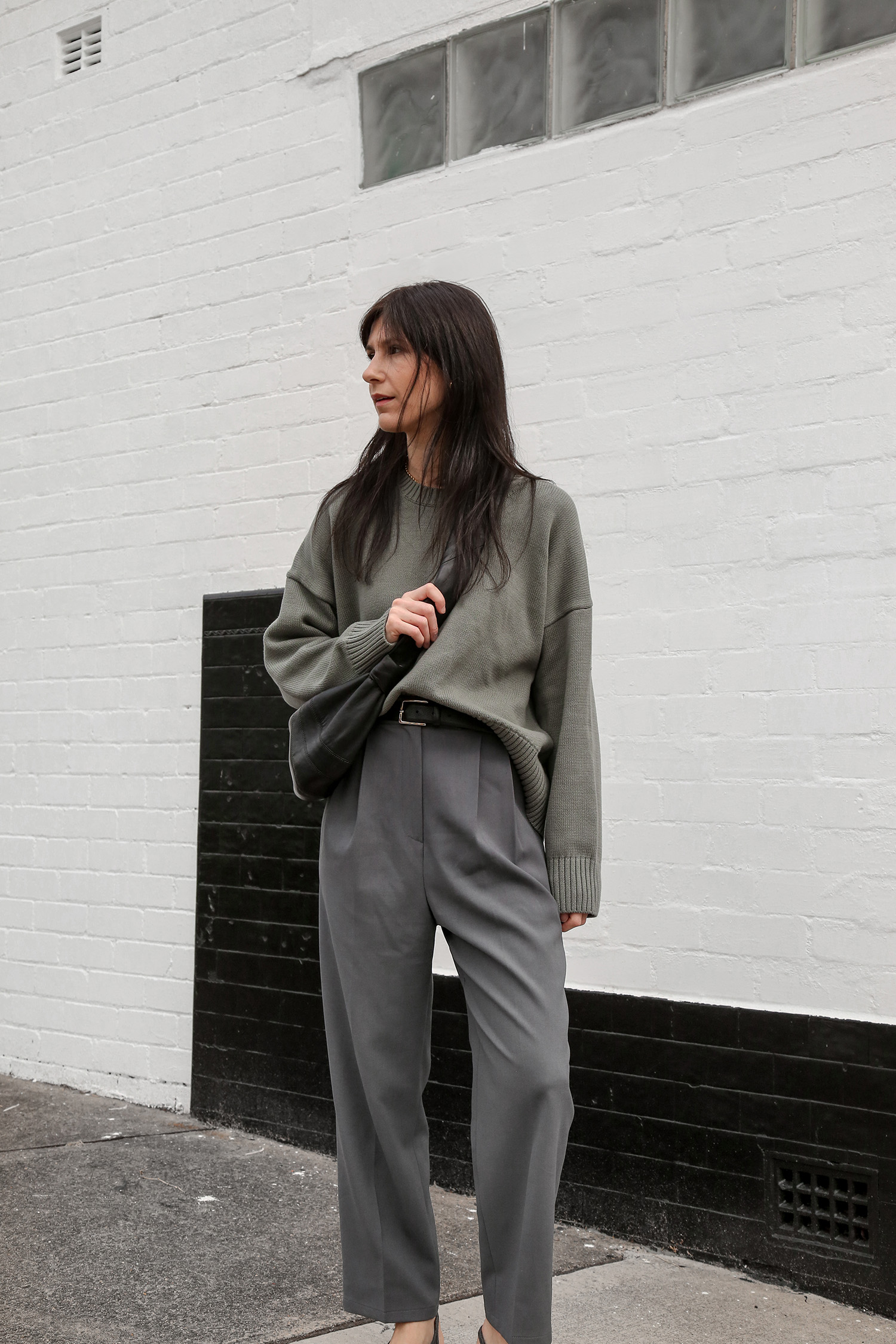
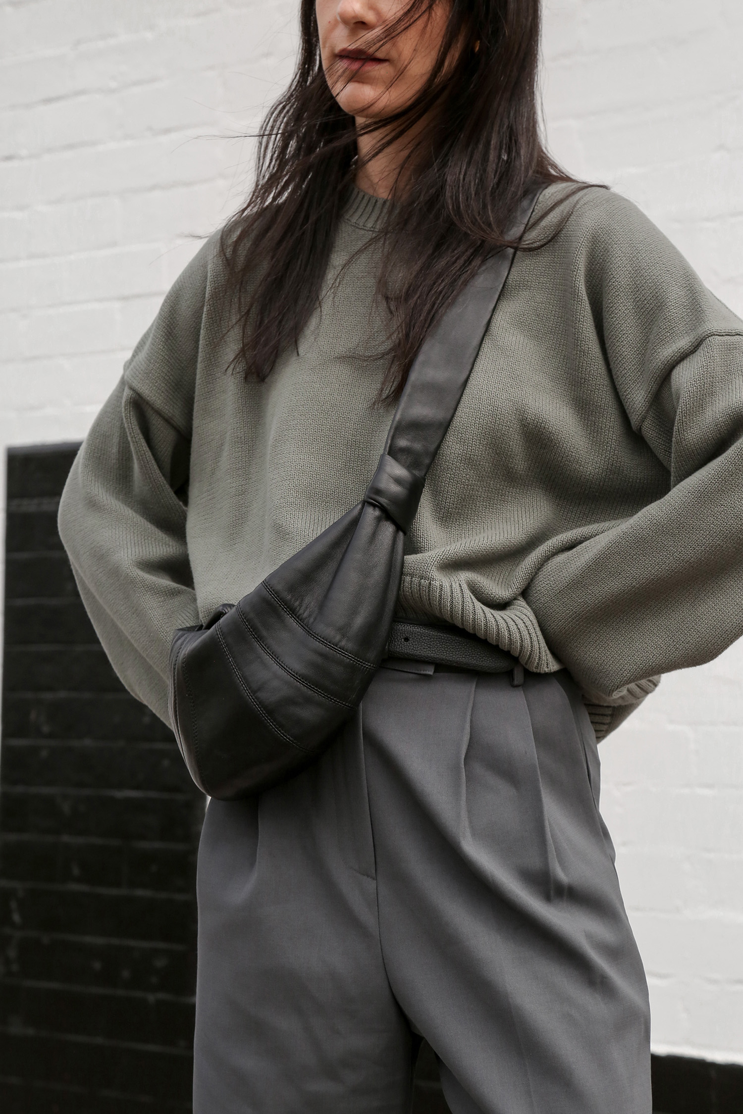
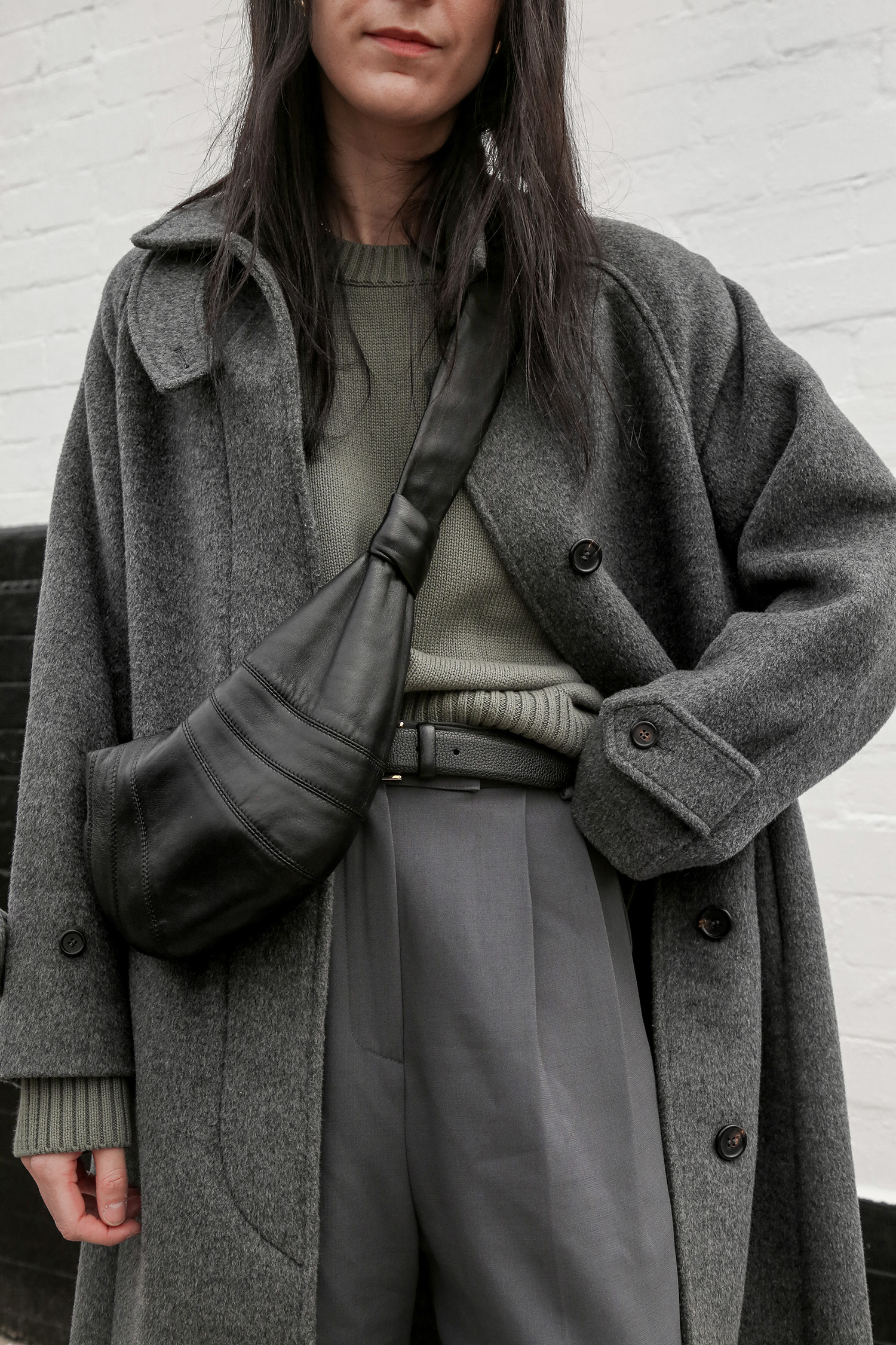
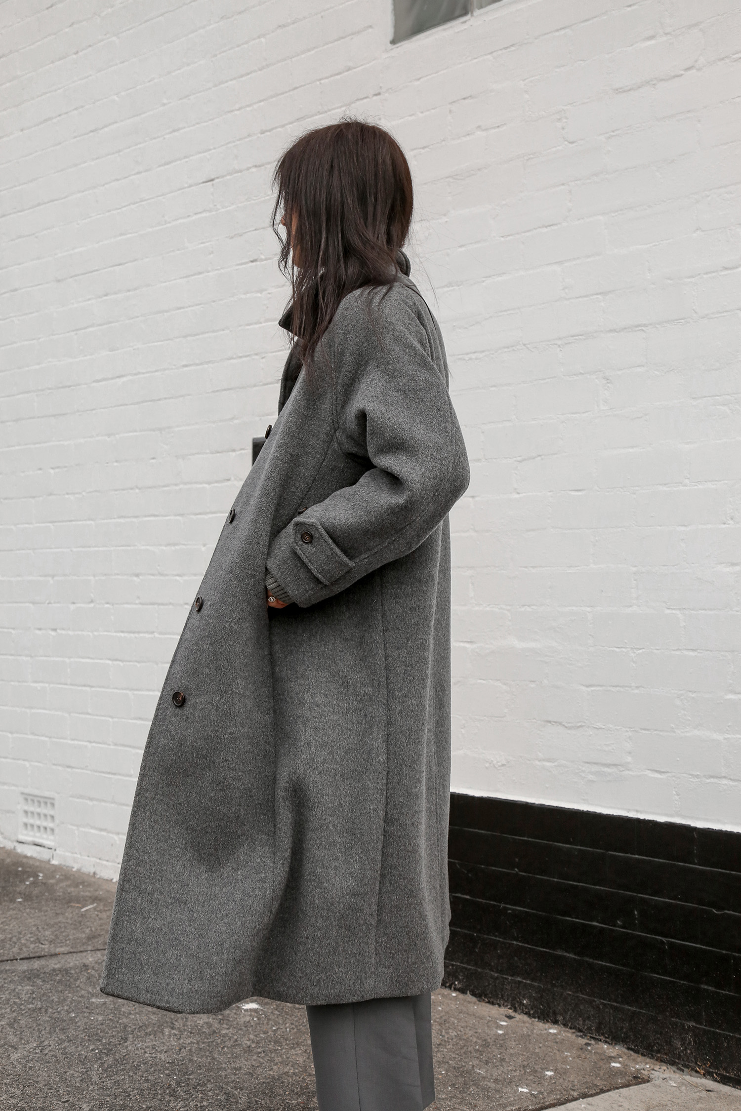
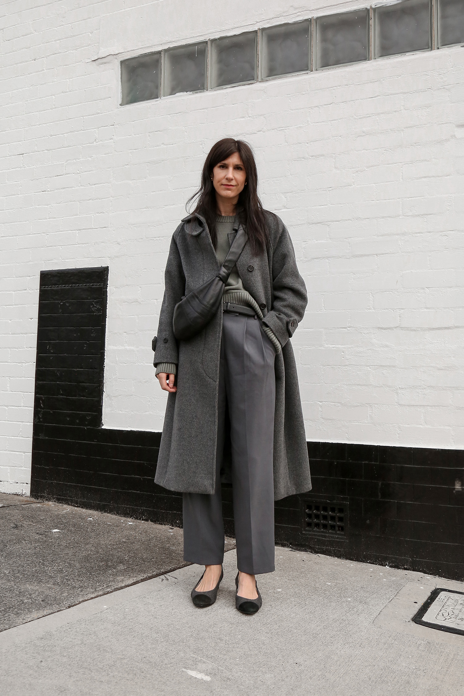
Wearing Quince sweater; Frankie Shop trousers; Andersons belt (back in stock!!); Vaneli two-tone pumps; Lemaire Croissant Bag (review here); Facade Pattern coat (old but this is similar)
When we think about colour, there are three components: hue, saturation, and value. Hue relates to the colour itself – where it sits on the spectrum. Saturation or “chroma”, relates to how intense or brilliant the colour is. Finally, we have value, which refers to how light or dark the colour is.
So my simple way to add in colour to your wardrobe? Start with items that are desaturated. Especially if you are either rebuilding, or curating your closet, it can feel a little intimidating to go for loud, punchy options if your wardrobe is packed with neutrals. That sudden intensity of colour can feel jarring and unapproachable.
Clearly not a guide for finding your best colour, but it is a gentle approach to branch out from a basic colour palette. The main thing to understand is the undertone. If your complexion has more of a pink undertone, you’re going to look better in cooler colours. If your complexion has more of a yellow undertone, warmer shades will suit you better. Where it gets tricky is if you have olive skin, meaning that there’s a green undertone with less redness to your complexion – this can pull warm or cool so colours that sit closer to the centre of the spectrum (ie. slightly warm or slightly cool) are likely to look best on you. It goes without saying that there is so much more nuance to this, and my general feeling is that we should wear the colours that we feel best in rather than ultimately be guided by the colours we’re told we look best in. But that all comes down to experimentation, and a lot of trial and error over time.
You can see this in action in the outfit above. Grounded against neutral base colours, I’ve added in a desaturated agave green sweater. This has a slightly grey quality to it, which is enhanced in this outfit because as it’s been paired with muted grey hues. Worn with a soft cream, that green streak tends to have a bit more prominence. What is great about desaturated colours is that they help you to shift away from a stark contrast of black vs white, while acting as an easy neutral against more deeply saturated shades.
Have you been thinking about adding some colour to your closet?


Loved learning about saturation, value and hue, I have not really heard this discussed as you have put it! Gorgeous coat and jumper 🙂